The gmail logo was designed the night before it was launched

The Fascinating Story behind the Design of the Gmail Logo

When it comes to popular email services, Gmail undoubtedly tops the list. Renowned for its user-friendly interface and effective email management features, Gmail has become an essential tool for millions of people worldwide. However, have you ever wondered about the story behind Gmail’s iconic logo? Surprisingly, this instantly recognizable logo was designed just a few hours before Gmail was launched!
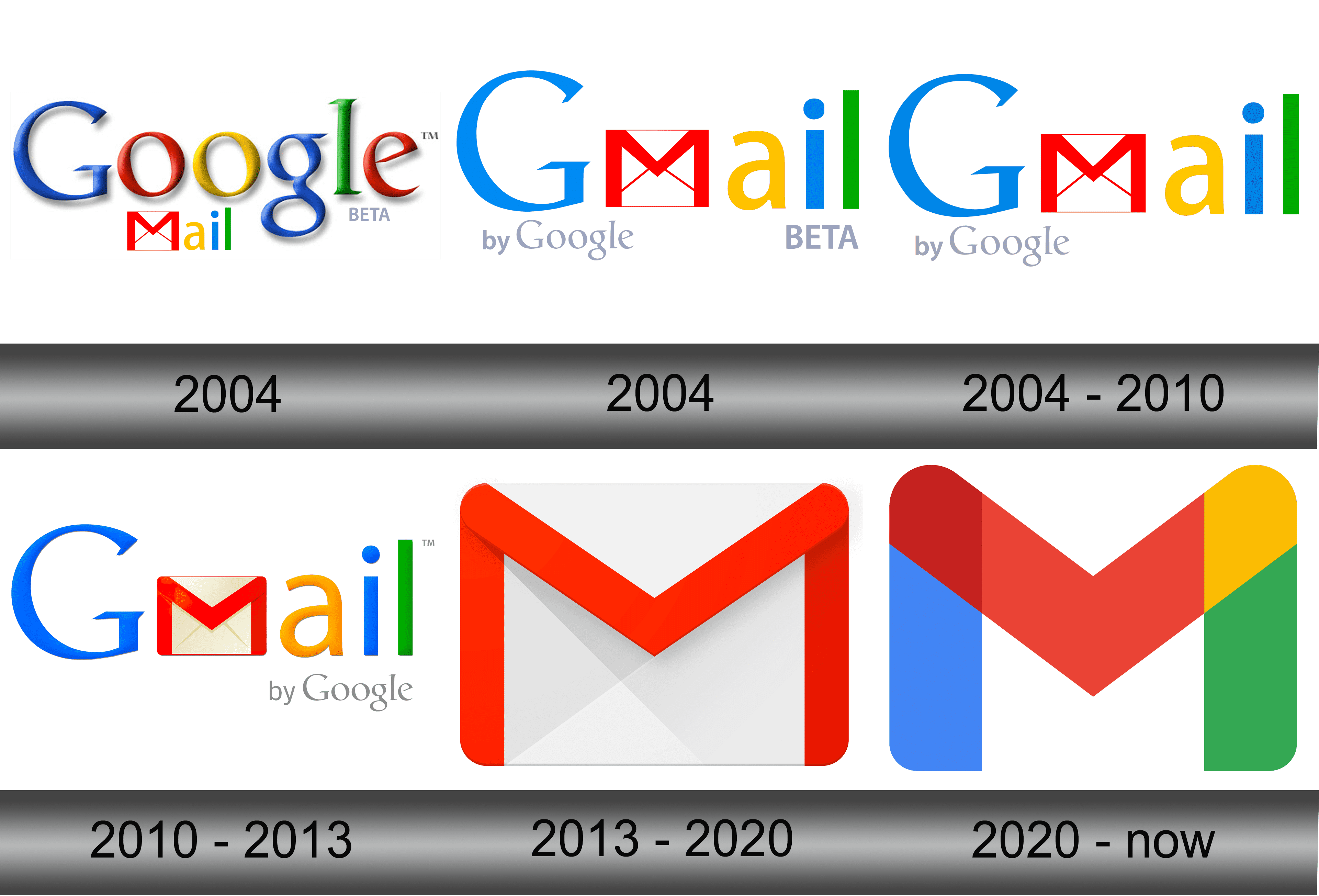
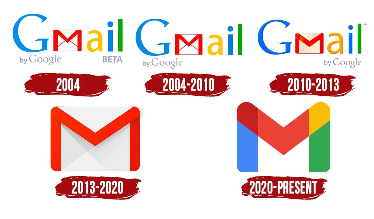
The Gmail logo has undergone a series of transformations throughout its existence. From the humble beginning to the current sleek and modern design, the iconic envelope has gone through an evolutionary journey. However, the most interesting part lies behind its initial creation.
According to reports, the renowned designer and creator of the Gmail logo, Kevin Fox, shared the intriguing tale of this last-minute design. The night before Gmail’s official launch on April 1, 2004, Fox was entrusted with the task of designing a logo that would capture the essence of the product. Faced with a tight deadline, Fox had to think creatively and efficiently to come up with a memorable and visually appealing representation of Gmail.

With limited time at his disposal, Fox drew inspiration from traditional mail envelopes, incorporating their essential elements into the logo design. The end result was a beautiful and instantly recognizable envelope shape, adorned with distinct lines that mirrored the folds found on physical envelopes. The logo was minimalistic, yet it conveyed the core purpose of Gmail—to be a digital mailbox.
Unbeknownst to Fox, his simple and elegant logo design would go on to become an iconic symbol for email communication. Its visual appeal, combined with Gmail’s outstanding features, helped propel the email service to new heights of popularity and success.
The story of the Gmail logo’s creation is a testament to both the creativity and ingenuity of designers, as well as the power of intuitive design choices. Even with limited time, Fox managed to create a logo that perfectly encapsulated the essence of the product. This remarkable feat highlights the importance of effective branding in today’s digital age.
In conclusion, the Gmail logo’s design journey is a captivating tale of creativity under pressure. Crafted the night before its launch, this logo has become synonymous with Gmail and its unparalleled email services. As we continue to use Gmail daily, whether for personal or professional purposes, let’s appreciate the artwork and design that went into creating this universally recognized symbol.
Source: The Atlantic - The Gmail Logo Was Designed the Night Before Gmail Launched
Share
Related Posts
Quick Links
Legal Stuff

