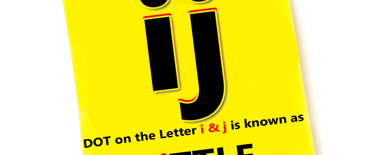
The dot on top of the letter i is called a tittle

The Fascinating Tale Behind the “Tittle”

Have you ever wondered about the small dot that crowns the letter “i”? Known as the tittle, it is a captivating detail that holds a significant role in the world of linguistics and typography. In this article, we delve into the origins, variations, and importance of the tittle, shedding light on this often-overlooked element.
The Origin of the Tittle
The word “tittle” traces its roots back to Old English and Latin origins. Derived from the Latin word “titulus,” meaning “title” or “superscription,” the term evolved to encompass a small distinguishing mark or point.
The concept of the tittle began gaining prominence during the Middle Ages. Before the invention of the printing press, manuscripts were meticulously crafted by hand, and the tittle served as a visual aid to enhance legibility. Scribes used it to differentiate the lowercase “i” from other similar-looking letters like “l” and “j.”
Tittles Across Languages

While the tittle may be most commonly associated with the letter “i” in English, its usage varies across different languages. In many languages, such as French, Italian, Spanish, and Portuguese, the tittle graces not only the letter “i” but also other letters like “j” and “ï.”
Interestingly, the tittle has played a crucial role in distinguishing between different letters in some languages. For instance, in Malayalam, a Dravidian language spoken in India, the tittle can appear above various consonants, altering their pronunciation and meaning. This exemplifies how a seemingly insignificant mark can significantly impact the written word.
The Tittle’s Typographical Significance
In the realm of typography, the tittle holds immense importance. Typography is the art and technique of arranging type to make the written language visually appealing and legible. The tittle plays a vital role in character recognition and ensuring proper text flow. It provides balance and symmetry, punctuating letters in a pleasing manner.
Furthermore, the tittle’s placement and design can vary based on the font style being used. Different typefaces may alter the size, shape, and position of the tittle, lending a unique visual identity to each font. Designers carefully consider these details to create appealing typography and enhance the overall reading experience.
Conclusion
The tittle, a small dot atop the letter “i,” may seem inconsequential at first glance. However, its historical context, linguistic variations, and typographical significance render it a fascinating subject to explore. Understanding the nuances of this minute detail highlights the intricacies and beauty of written language.
Note: This article draws information from the following source: Wikipedia
Related Posts
Quick Links
Legal Stuff

